 Logo Design
Transform your brand's online image
A professional logo plays an often overlooked yet important role in communicating the image and mission of your business. It is the one piece of your brand that has to work at every size, on every surface, for years.
What's included
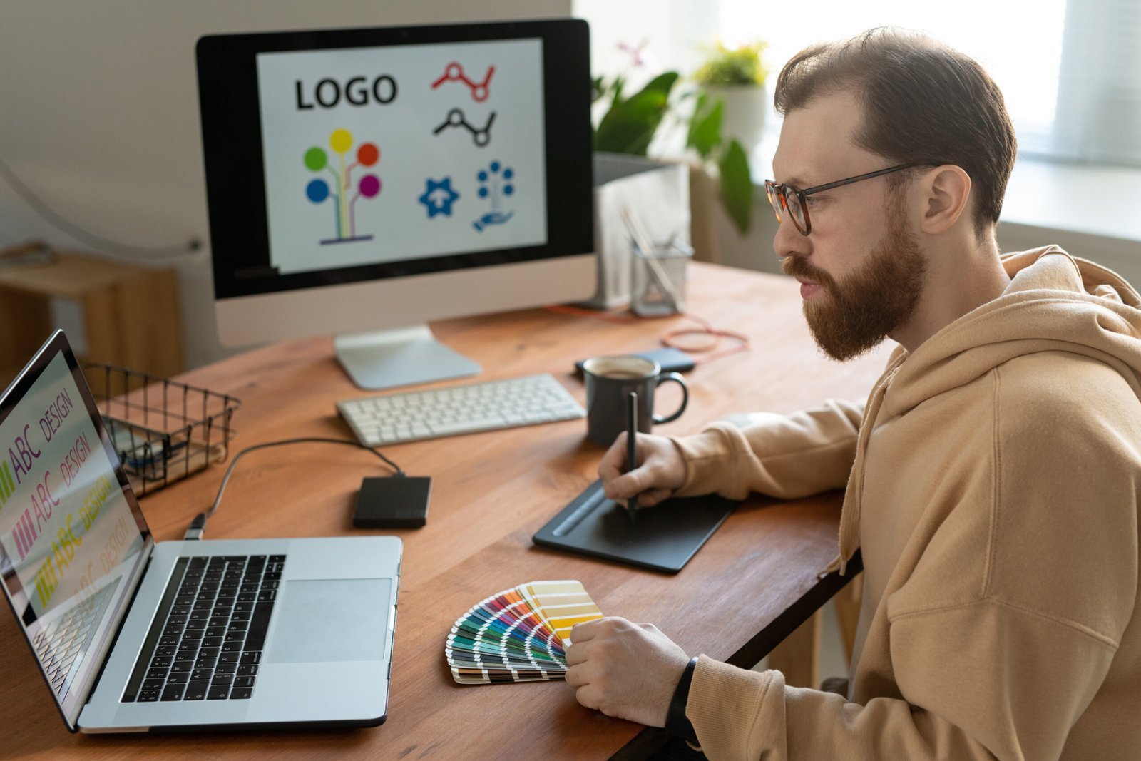
A mark on its own is half a job. What you get is the mark plus the small system that keeps it looking the same everywhere you put it.
- 01
Directions to choose from
A handful of genuinely different routes rather than one idea shown in four colours, so the choice is a real one.
- 02
The finished mark
Drawn properly and refined until it holds at a shopfront size and at the size of a browser tab.
- 03
Every file you need
Vector and image files, full colour, single colour and reversed for dark backgrounds, plus a favicon for the site.
- 04
Type and colour
The typefaces and colours that sit alongside the mark, so signage, the site and a printed menu all look related.
- 05
Where it goes
How the mark should sit on a sign, a van, a social profile and a website header, with the spacing that keeps it readable.
- 06
It belongs to you
The finished artwork is handed over and it is yours, with no licence to renew and nothing held back.
How the mark gets made
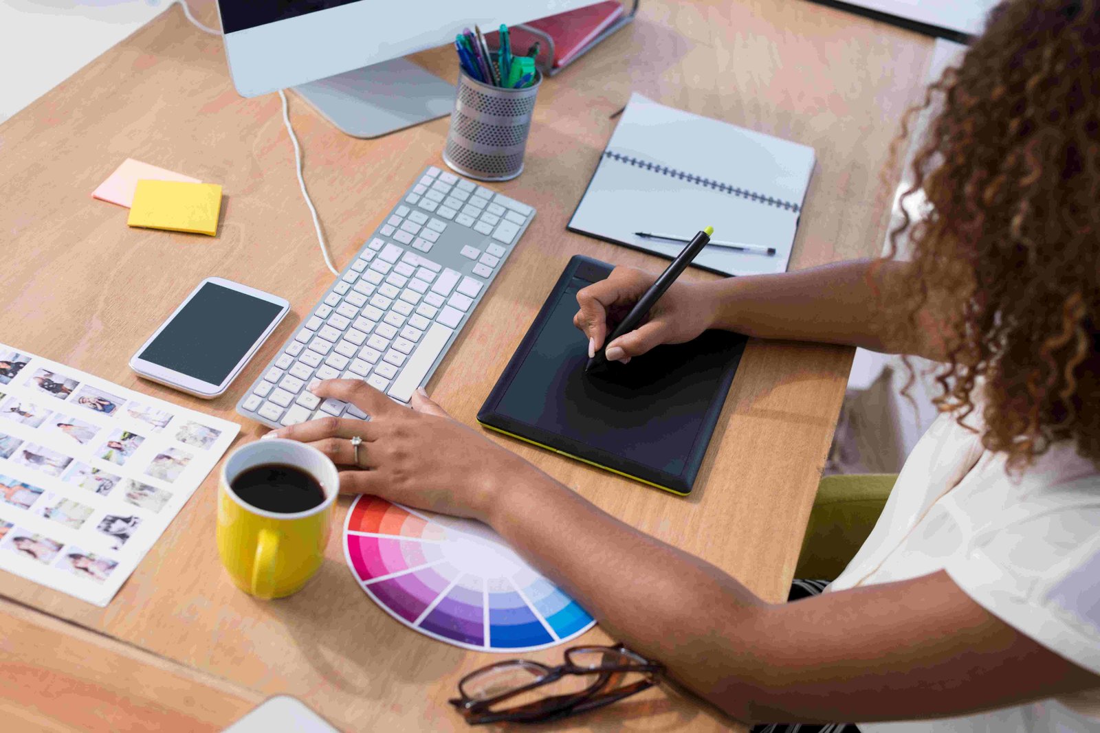
Logo work is short compared with a website build, but the order matters: understand the business, draw widely, then narrow hard.
- 01
Learn the business
What you sell, who buys it, who you are up against and what the mark has to sit on — a window, a truck, a paper cup.
- 02
Draw and show
Several distinct directions, presented at the sizes they will really be used at rather than floating in the middle of a slide.
- 03
Refine and hand over
One direction is chosen and sharpened, then the full file set and the type and colour notes come across to you.
Marks in place